How a Value Scale Can Really Improve Your Pencil Shading
You may have heard that a value scale can assist in better pencil shading, but what if you know next to nothing about value scales?
You may have heard about how a value scale can make your drawing look more realistic, but what if you have not had much success with this?
If you would love to learn more about this, then this article is for you.
The truth is, value scales are an excellent way to help you achieve more professional and realistic pencil drawings.
In this post, we will cover the basic value types that should be found in any drawing, we will look at several examples of value scales, and we will learn about pencil grades and their role in making value scales. Additionally, you will see step by step how to make your very own value scale with pencils. Finally, you will discover how you can use value scales effectively while you are shading a drawing.
It is high time you scale up your drawing game by learning how a value scale will improve your pencil shading. Keep reading!
Table of Contents
What Are the 5 Values of Shading?
You might have noticed that some drawings look very professional and realistic. In contrast, others will look less professional, despite the energy and time spent working on them. The difference is the use of the values of shading.
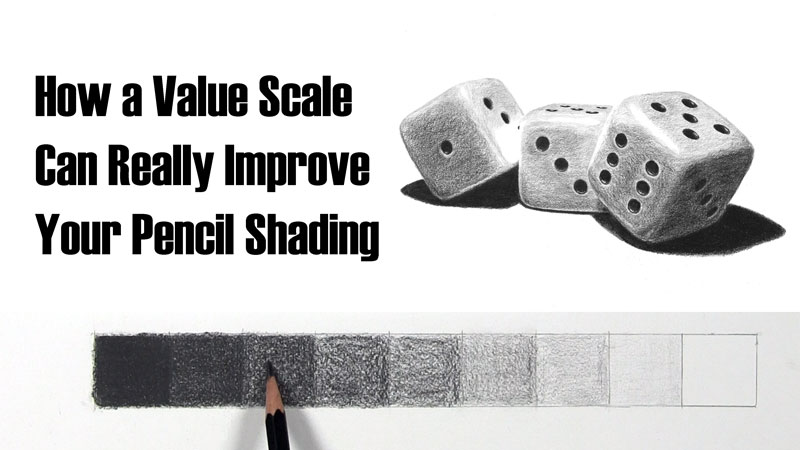
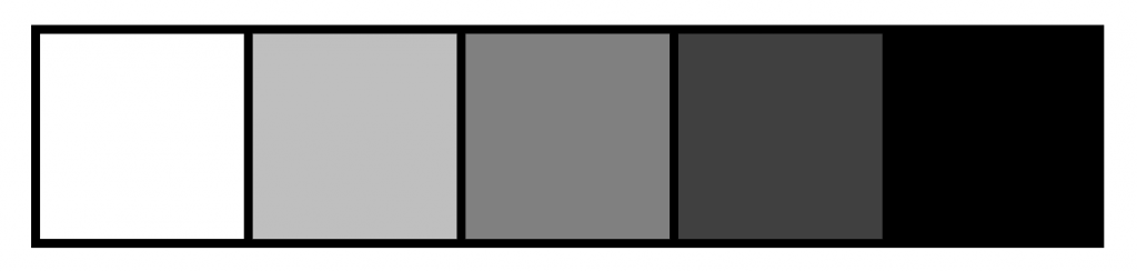
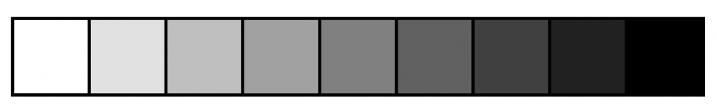
A value scale is a rectangular arrangement of boxes that comprise different values from light to dark. We can represent a simple range of value with a 5-step value scale like the one below.
The five values of shading make a drawing better by giving the drawn object a three-dimensional form on paper.
Additionally, if your drawings lack a full range of value, you can see quick and noticeable improvement by fixing this.
Using a value scale is an easy way to check that you are using a full range of value which, in turn, will drastically improve your pencil shading skills and the overall outcome of your drawings.
This 5-value scale is a way to simplify the multitude of values within the gradient from white to black. The five shading values can be summed up using the following terms:
- Highlight
- Reflected light
- Midtone
- Core shadow
- Cast shadow
I will briefly discuss each of these five values in the following paragraphs.
Highlight
This is otherwise referred to as the full light and is most often represented with white tone. The highlight location can best be described as the location on an object where the reflection of light in that region is the most intense. The light source is shining most brightly on the object in this region.
Reflected Light
Reflected light is slightly darker than a highlight. It is simply the light reflected onto your object caused by a source of light that is different than your main source of light.
Usually, reflected light is slightly lighter than the midtone values. This region looks light because it is next to two darker tones, which are the cast shadow and the shadow edge. It is usually at the outer edge of the object just before the cast shadow.
Using reflected light in a drawing helps to provide the appearance of roundness to an object as it curves back toward darker areas with more shadow.
Midtone
This is also referred to as the halftone. The midtone is the local color or the actual color of the object’s value in view.
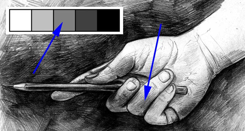
In the midtone regions, the light is hitting the regions, but it is done so that it is not as intense as the regions of highlight. Your full light starts to spread and fade when your full light strikes the object in view. The result is the midtone when you get midway to your shadow.
Core Shadow
Core shadows are the darker regions of a shaded object. They are the darker value of the actual or local color.
This is the region where light is increasingly prevented from hitting. As a result of this light denial, there is a production of an area of shadow.
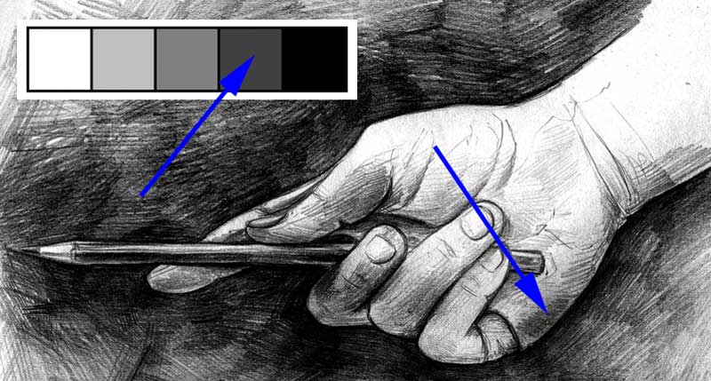
This is where your object is turned away from the light source and you can find the darkest shadow area on the surface of the object.
Cast Shadow
This is where light is completely blocked from reaching solely because another object is in the way. Cast shadows are where you will find the darkest values for your drawing.
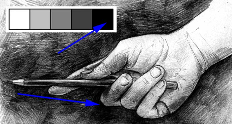
A cast shadow is the shadow that is cast onto the ground or another nearby object by the primary subject. The cast shadow is not found on the main object itself.
Value Scale Examples
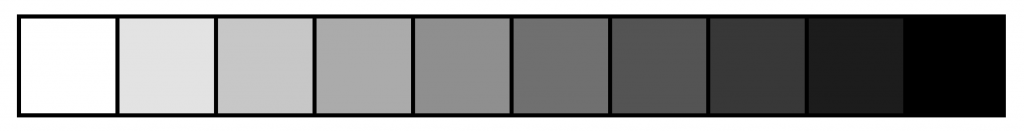
Although the entire range of values from white to black can be simplified into five basic values, a 5-step value scale such as the one described above is just a starting point. We can represent a range of values by using scales that are greater than five steps.
Other value scale examples include a 7-step value scale which has seven boxes, a 9-step value scale with nine boxes, and a 10-step value scale with, you guessed it, ten boxes!
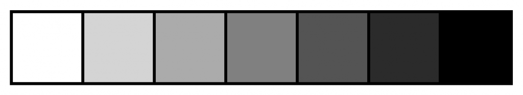
Personally, I prefer using value scales with an odd number. That way I can easily identify a middle tone along with a white highlight and black cast shadow. Then I can fill the gaps in between. More on this later in the article!
Which value scale you use is ultimately a matter of personal preference. Nonetheless, it is highly recommended that you do not have a value scale of too many steps, or else you could get easily confused. As a beginner, you can play around with a value scale up to 10 boxes.
You can create your value scale yourself, buy from an art store, or print out printable ones. Sometimes, you might want to use more than one type of value scale. I will discuss this later in the post as well.
Commercial and Digital Value Scales
When it comes to having your own value scale, you have several options. You can buy a commercial value scale, you can make or acquire a digital value scale, and/or you can create your own with pencil shading. Let’s talk about commercial and digital value scales first.
Commercial Value Scale
Affiliate Disclaimer: The links in the section below are affiliate links. I will receive a small commission if a purchase is made through one of these links. Learn more here.
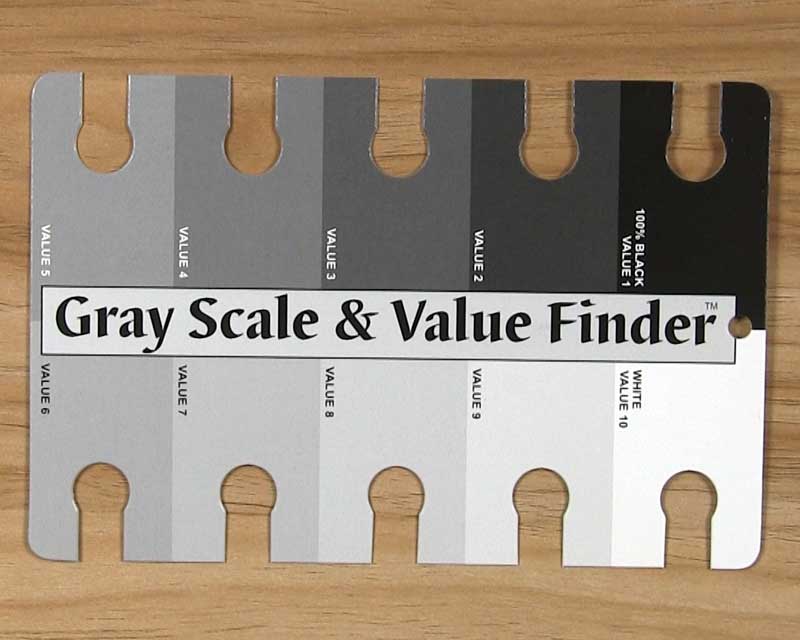
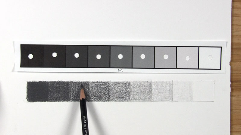
An example of a commercial value scale is this Gray Scale and Value Finder. This gray scale value finder is divided into 10 different shades of gray. At one end of the spectrum is a black swatch, and you will find a white swatch at the spectrum’s other end. In between, there are different shades of gray.
When using this tool, you have to keep in mind that the shades on the individual sections do not perfectly match the graphite pencil tones you apply to your drawing paper.
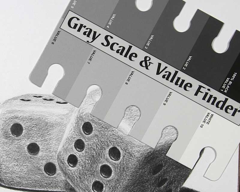
Still, this is a helpful tool if you remember to use it to evaluate the values and their relative lightness or darkness rather than look for exact matches.
Digital Value Scales
Alternatively, if you are proficient with Photoshop, you can make your own digital value scale.
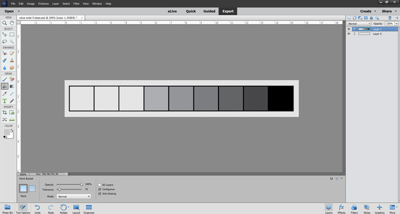
I like digital value scales because I can print a black-and-white version of my reference photo and easily compare the values on the printed scale to the values on the photo to see where they match.
For your convenience, I have a selection of printable value scales that I already made. You can download them using the links below.
- Printable 5-step value scale
- Printable 6-step value scale
- Printable 7-step value scale
- Printable 8-step value scale
- Printable 9-step value scale
- Printable 10-step value scale
- Printable 11-step value scale
- Printable 12-step value scale
For easy comparison during any of your drawings, you can hole punch each box or crop right up to the edge.
Pencil Grades for Making Value Scales with Shading
In a little bit, we’re going to get into how to make your very own value scale with graphite pencils. First though, it would be beneficial to learn a few basics about the range of pencil grades available.
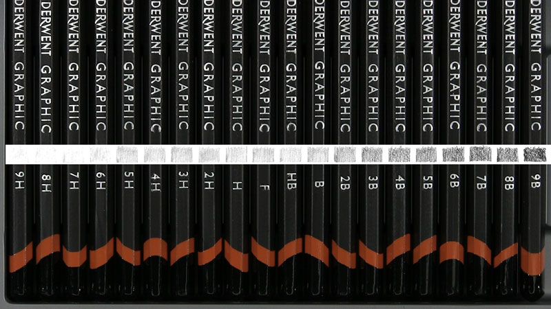
The graphite grading scale is a system to help describe how light or dark the mark from a graphite pencil is. This same system also gives us an idea as to how hard or soft the pencil’s core is.
You might have seen a little number and/or letter on your pencil. You might have seen letters such as H, B, or F. They are all a pencil’s grade.
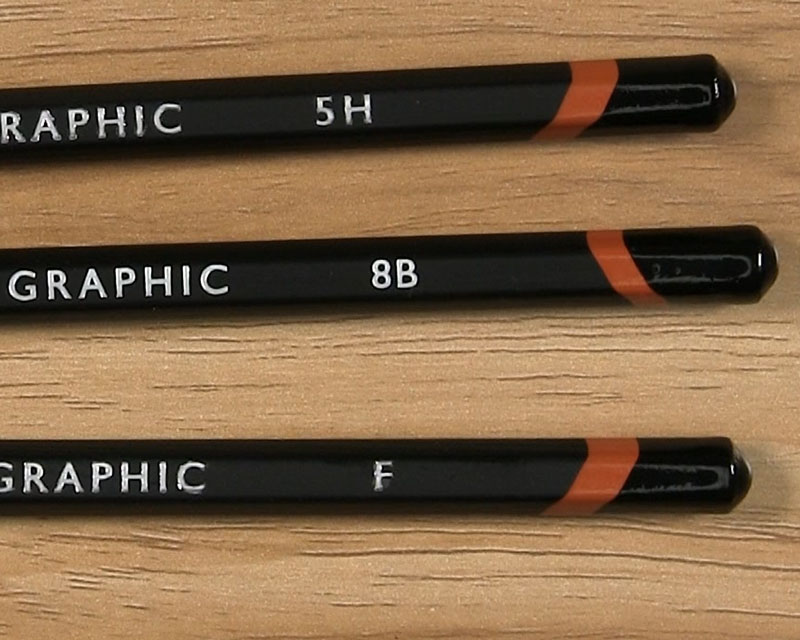
B represents blackness, while H represents hardness. H pencils have less graphite and more clay filler, which make them hard and produce lighter lines. On the other hand, B pencils have more graphite and less clay filler, hence making them darker and softer.
The F pencil grade means Fine. This pencil can be sharpened to a fine point.
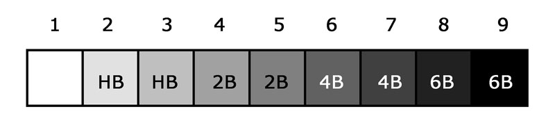
Using the graphite grading scale, pencils are most often graded from 9H to 9B in the following order: 9H, 8H, 7H, 6H, 5H, 4H, 3H, 2H, H, F, HB, B, 2B, 3B, 4B, 5B, 6B, 7B, 8B, and 9B.
What Is the Lightest Shading Pencil?
Just because a 9H is the lightest pencil indicated on the graphite grading scale, that doesn’t mean it is the best pencil for shading light values. The best choice for the lightest shading pencil will depend on the range of pencils you decide to use for any given drawing.
For example, I often use a 2H pencil to sketch an initial outline. Then, I use pencils ranging from HB to 6B for shading. In this instance, I would use a very light application of my HB pencil to achieve the lightest tones after the highlights.
You could use anything from a 4H to a B pencil or even a slightly darker 2B pencil to achieve a similar effect. It depends a lot on your own preferences and style as an artist.
Which Pencil Numbers Are Considered the Best for Shading?
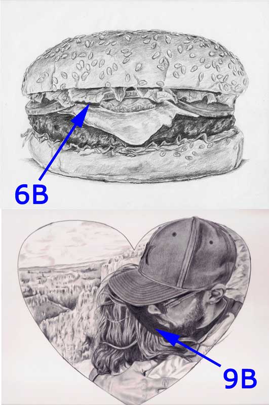
The B pencils have a soft core, making it easy for them to apply large amounts of graphite on the drawing surface. For this reason, you can consider any pencil with any number followed by the letter B to be a good choice for shading.
As for which is the best, it again depends on the range of pencils you are using for your drawing. Naturally, a 9B pencil will lay down darker tones than a 6B pencil (assuming you are not applying multiple layers of 6B). However, if the range of pencils for your artwork is 2H to 6B, you would use your B pencils for shading a range of values, and your 6B would be reserved for the darkest values or cast shadows.
Common and Practical Uses for Pencil Grades
The following table will give you an idea of the most common and practical uses for each pencil grade. With that said, you are the artist and have the creative freedom to live outside of these “rules”!
| Pencil Grade | Common and Practical Uses |
| 9H-5H | This pencil type is suitable for achieving sketches for art painting or watercolor. They don’t show through the paint since they are light. |
| 4H-2H | They leave a light mark and are suitable for guidelines, technical drawings, light sketches, and outlines. |
| H, F, HB, and B | These pencils are great for writing and simple sketches. HB (also known as the #2 pencil) is a multipurpose pencil-type suitable for both writing and drawing. |
| 2B-9B | These pencils leave darker marks and produce a soft texture. This makes them suitable for tonal modeling and shading as well. B pencils with higher numbers can smudge and blend well. |
How Do You Shade a Value Scale with a Pencil?
Creating a value scale from scratch is an excellent exercise in which many beginning artists participate. Art teachers commonly require their students to make their very own value scale. But why?
Value scales help students to more easily identify highlights, midtones, and shadows. More importantly, remember that value scales are helpful in creating a full range of value in a drawing.
Making a value scale depends on the number of boxes you want your scale to have. You should also consider the range of graphite pencils you typically use for your drawings.
In the following steps, I’m going to outline how to make a 9-point value scale. If you’d rather make a value scale with a different number of boxes, that’s perfectly fine. The process is the same regardless.
Be sure to be patient with this process, especially if it’s your first time. With practice and experience, it will get easier to make a value scale.
Set Up the Value Scale’s Boxes and the Pencils
Affiliate Disclaimer: The links in the section below are affiliate links. I will receive a small commission if a purchase is made through one of these links. Learn more here.
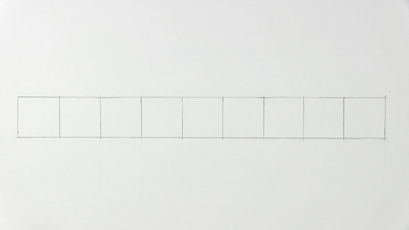
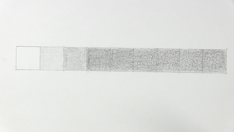
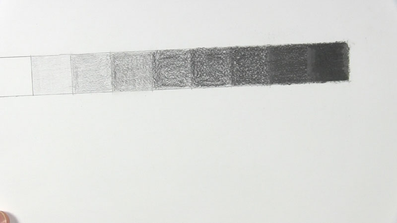
Start by using a ruler to draw a rectangle that is one inch wide by nine inches long. Then divide the rectangle into nine one-inch boxes.
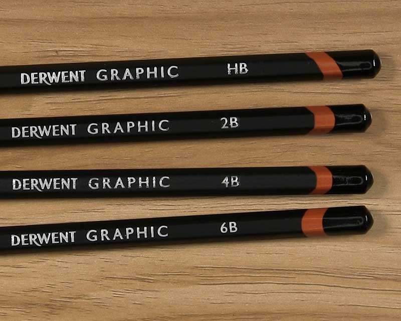
Decide on the range of graphite pencils you want to use for your value scale. For this example, I’m using an HB, 2B, 4B, and 6B, because these are the pencils I use most often when shading my drawings. If you often shade with 4H pencils or 9B pencils or anything else in between, make sure to include those in your selection.
If you do not have this variety of pencils available to achieve a value scale, you can simply use one pencil for the entire scale. This means that if you only have a 2B pencil or a standard #2 (HB) pencil, you will use that one pencil to achieve all the shades. Of course, you will need to increase the amount of layering and pencil pressure as you shade the darker values on the scale.
Assign Your Pencils to Specific Boxes
Excluding one of the end boxes as the white box, look at the remaining 8 boxes. Divide these boxes by the number of pencils you will use.
So for my example, I will be using four pencils (HB, 2B, 4B, and 6B). Eight divided by four equals two. So I will use the HB for two boxes, 2B for two boxes, 4B for two boxes, and 6B for two boxes.
But actually…
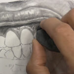
Shade by Slowly Building Up the Values
I want this value scale to resemble my method of shading. When I shade a drawing, I usually start with a lighter pencil and build up darker tones gradually in layers.
As such, I will begin with an HB pencil in the second box after the white one. I will shade that box with an extremely light touch.
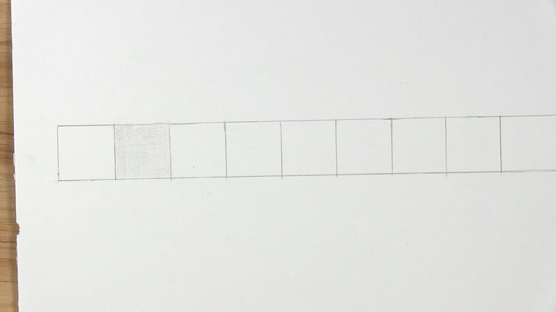
Then I will extend that same level of shading across every box of the value scale.
So essentially, every box will have layered tones from the boxes before it in addition to extra tones applied on top.
Shade the Remaining Boxes with Increasingly Darker Values
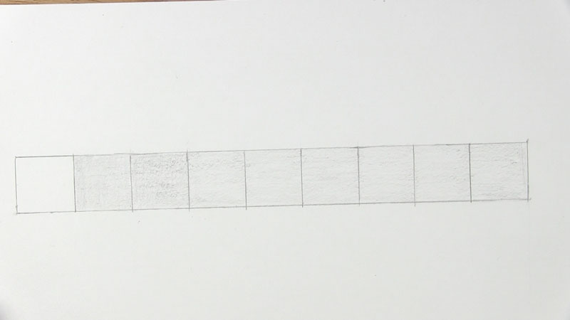
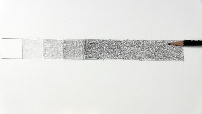
For the third box, stay with the HB pencil. Apply just a little more pressure so the value is slightly darker than the value in Box 2. Maintain this same pressure in the other boxes for a consistent value in Boxes 3 through 9.
Now for the fourth box, use a 2B pencil. Apply a light layer of tones so Box 4 is slightly darker than Box 3. Extend the value from Box 4 to the other Boxes up to Box 9.
Use the 2B pencil again with a bit more pressure as you work on Box 5. This is the midtone box, and the value here should be a gray that is halfway between black and white. So far, your value scale should have 5 boxes completed that gradually transition from white to gray. Boxes 6 through 9 should look like Box 5 for now.
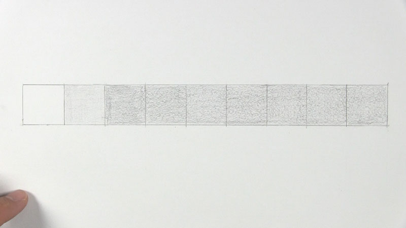
Continue this same process with the remaining boxes. For Boxes 6 and 7, use a 4B pencil. Box 6 should have a light application of the 4B. Box 7 should have a slightly heavier application. Remember to keep extending your pencil tones to the other boxes as well.
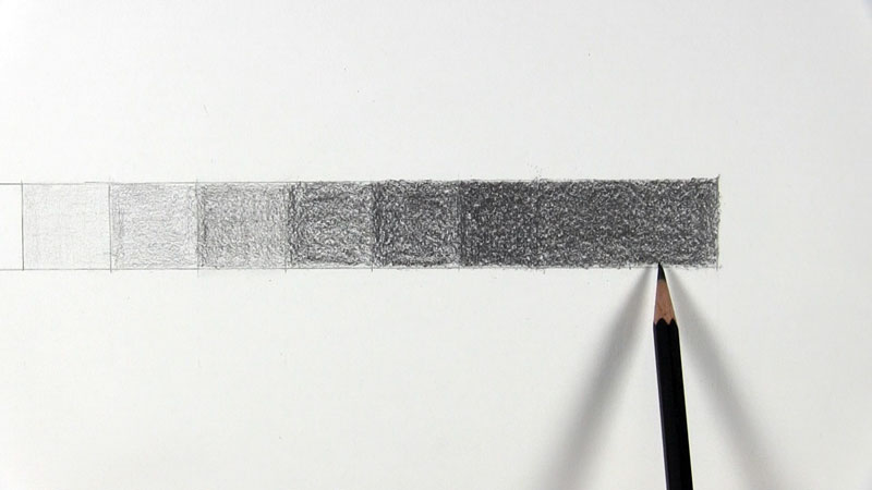
Repeat the above step with Boxes 8 and 9, but use a 6B instead of a 4B. Use light pressure from the 6B on Box 8, ensuring that it is still darker than Box 7.
Box 9 should be as black as you can get it based on the softest pencil in your selection.
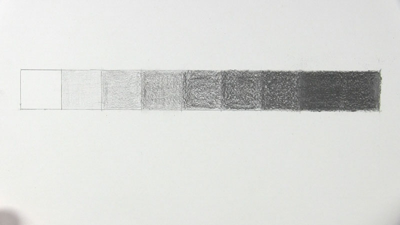
Check for a Gradual Transition of Values
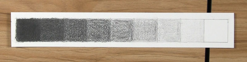
Take a look at your value scale. There should be a very subtle and gradual transition from a lighter value to a darker value with each adjacent box.
If you see any boxes that are too light compared to the neighboring boxes, make careful adjustments as necessary. Start with the lighter value boxes, though. It’s easier to make a light value darker than it is to make a dark value lighter.
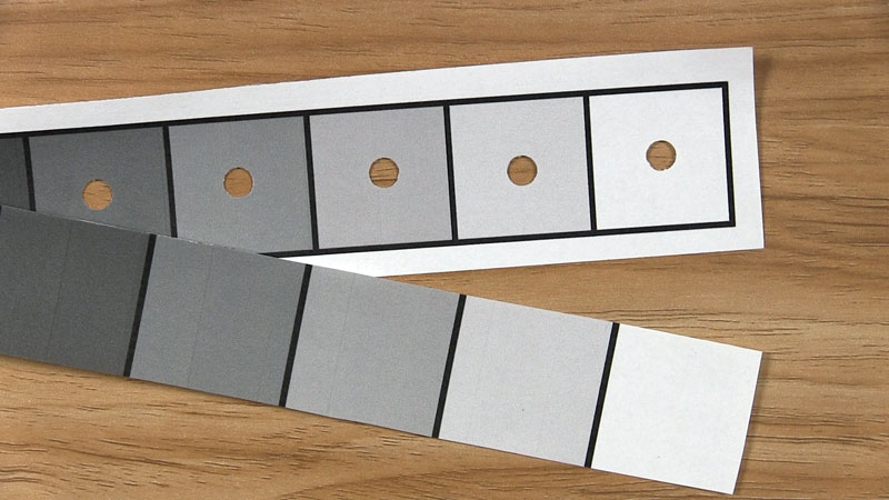
Try placing a printable value scale next to your handmade value scale, one above the other one.
Clearly, the graphite pencils are unable to create the exact replications of the grays and black ink that comes from a printer. That’s okay, though. Just check that the progression from black to white on your handmade value scale is spread out as smoothly and as evenly as on the printable scale. This comparison makes it easier to see where you might need to make adjustments.
Prep Your Value Scale for Use
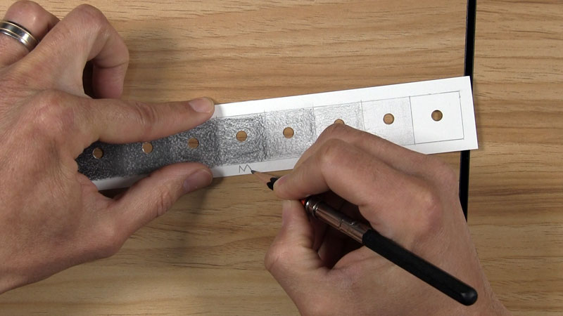
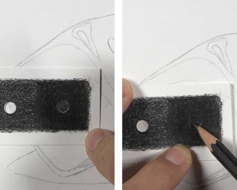
When you are happy with your value scale, cut it out. Leave a border around it thick enough to allow your fingers to hold it without smudging.
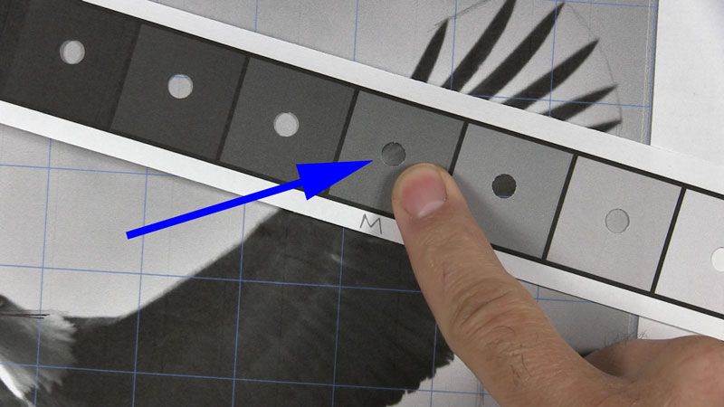
The final step is to hole punch the center of each box.
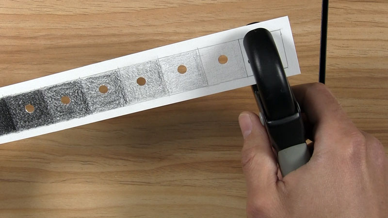
An optional step is to write an “M” for “midtone” or an “H” for “halftone” in the center box for quicker identification during use.
Keep Practicing
Remember, creating a value scale in pencil takes practice. You might have struggled to get a gradual transition this first time, but that’s okay!
There are other ways to create a value scale, too. You might want to start with the white, black, and midtone boxes first. Then you can work your way from white or black toward the middle. You can read more about this alternate method in this article.
I created a value scale worksheet PDF that you can download using the link below. Print it out and practice as often as you want!
Value Scale Practice Worksheet
How to Use Value Scales for Better Shading
So now that we know more about value scales and how to make them, it’s time to see how to use them in our drawings.
There is no one-way approach to using value scales. Their use varies from artist to artist.
Here’s how I like to use them.
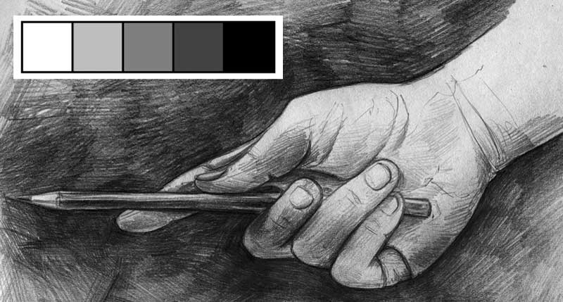
I like to use two value scales: one for my reference photo and another for my drawing.
I use a printable value scale to match values on a black-and-white reference photo. The value scale and reference photo are both printed from the same printer, so they will contain the same black and many of the same grays.
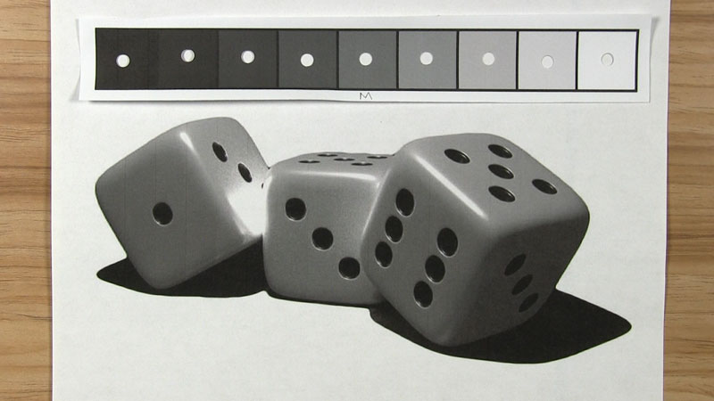
I use my handmade value scale to replicate shading on my drawing paper. I created my handmade value scale with graphite pencils, and I create my drawing with graphite pencils. Therefore, both will have the same black and many of the same grays.
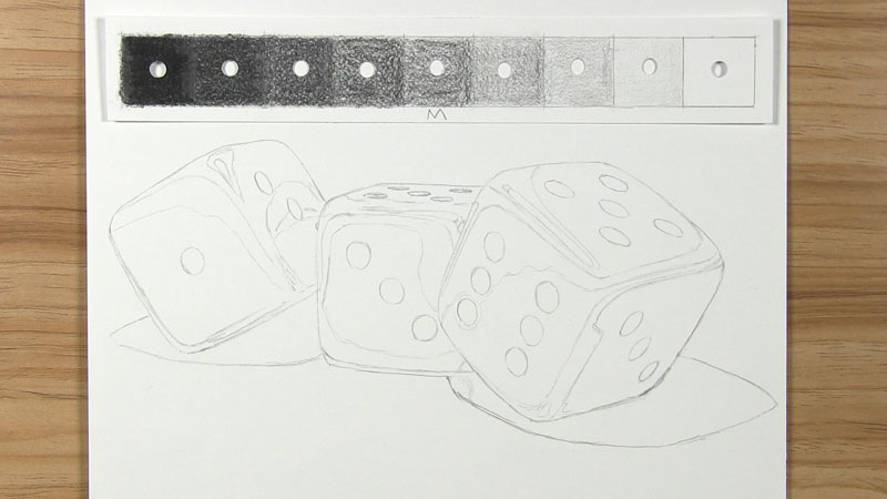
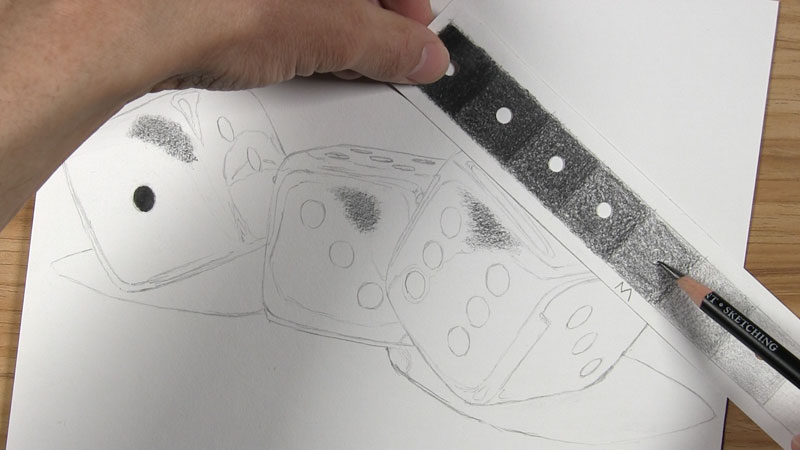
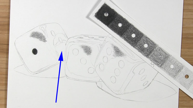
Notice how in my line drawing, I drew more than just the contour outline. I also drew light indications of where some of the value changes are located.
When your line drawing is complete and you are ready to shade, here are the steps.
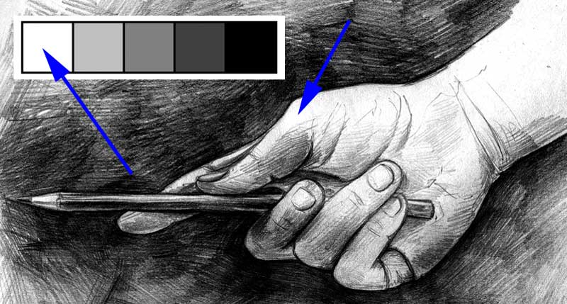
Identify an Area of Black Value
Start by identifying an area of black cast shadow on your reference photo. Do this by placing the black box of the printable value scale over the area of the photo. Look at the edges of the hole punch to ensure that the black on the value scale and the black from the photo are the same.
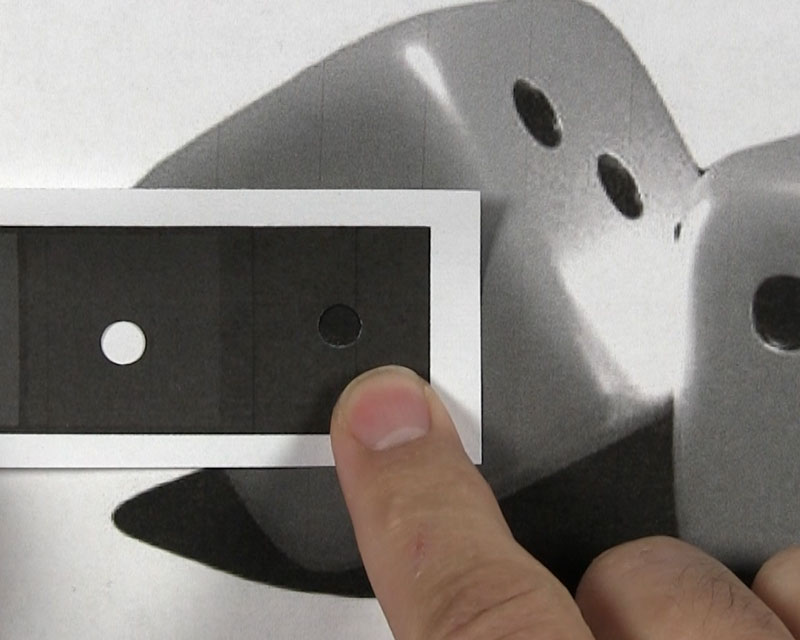
Find this same area on your drawing paper. Use your pencils to build up the values until you get a black that is similar to the black box on your value scale.
Remember when we created the value scale earlier in the post, I created a black by slowly building up layers of HB, 2B, 4B, and 6B. You don’t necessarily need to use all 4 of these pencils for every black area, if you don’t want to. I would try two at the very minimum. Keep comparing the area with your value scale and keep building up the value with additional applications of graphite until the values match.
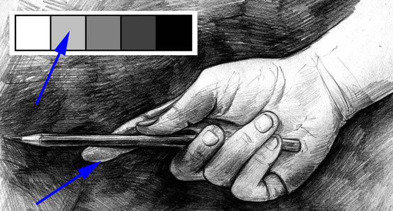
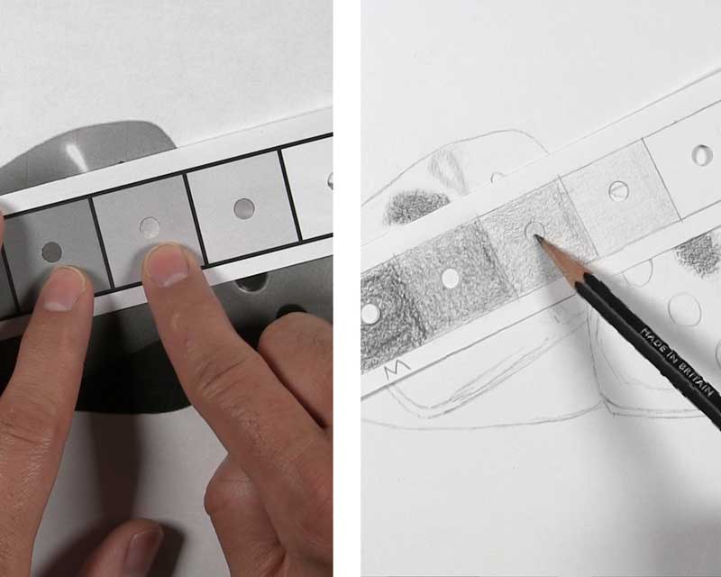
Identify Areas of Midtone
Next, look for three to five midtone areas. Compare the middle midtone box from your printable value scale to several areas of your reference photo.
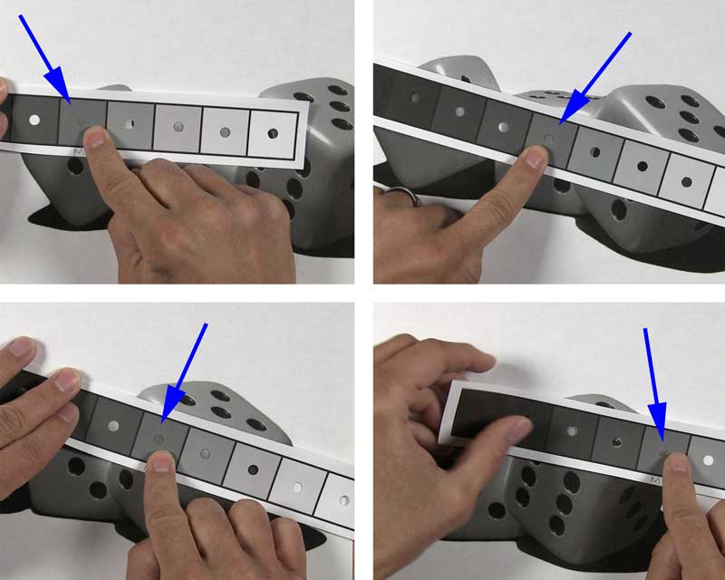
When you have a match, recreate those same values in the appropriate areas of your drawing. I made the midtone box of my handmade value scale with the HB and 2B pencils, so I would use those on the drawing paper. Use the middle “M” midtone box on your handmade value scale to keep checking your drawing until you build up the values to match.
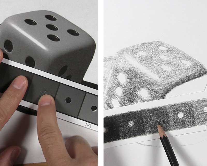
Identify an Area of White Value
After repeating the above steps for a few midtone areas, identify one area of white highlight. Confirm by placing the white box from your printable scale over a white area on your reference.
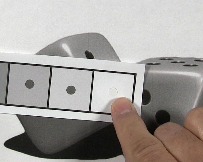
Since no shading is required for a direct highlight, make a mental note of this particular highlight area on your drawing paper.
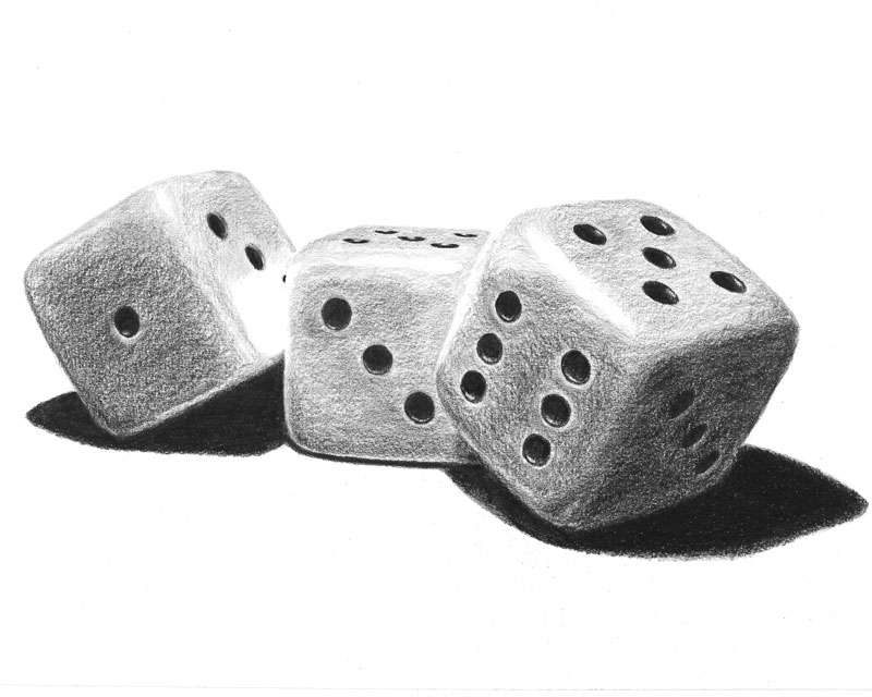
Shade Your Drawing with a Full Range of Value
By identifying an area of black cast shadow and an area of white highlight, you have established both extremes of a full range of value.
By identifying several midtone areas, you can more easily identify which areas need to be lighter than the midtones and which need to be darker than the midtones.
As you shade the rest of your drawing, you can occasionally refer to your value scales to make sure you are on track.
While you shade reflected light and other light areas, compare them with the boxes that fall between your white and midtone boxes on your value scales.
While you shade core shadows and other dark areas, compare them with the boxes falling between your midtone box and your black box.
There may be instances when you won’t find a match for a value on your reference photo. The value might be darker than one box but lighter than the box next to it. When this happens, just use shading on your drawing paper that falls between the same corresponding values.
Allow the Value Scale to Support You, Not Hinder You
Do you need to use the value scale to check every single value as you shade?
Absolutely not.
That will add countless hours to a drawing that might already take hours to finish.
The value scale is meant to be a tool to supplement and support your work. Most of the time, as you progress with the shading of your drawing, you will make visual comparisons and estimations as to the values you need to use that are relative to neighboring tones you have already applied. You can use your value scales to spot check and, if necessary, darken or lighten areas you have already shaded.
Don’t worry about perfection. Even without comparing every square inch of your paper to your value scale, you will see significant improvements in the range of value used in your drawings and your overall shading abilities over time.
Conclusion
So what’s next? It’s simple! Start creating your value scale!
It’s no doubt that you have seen how a value scale and your pencil selections can take your drawing and shading game up to another level.
Now that you have learned it, take action:
- Find a black-and-white reference photo and print it out.
- Print out one of the digital value scales from this article.
- Make your own handmade value scale with your pencils.
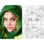
- Draw a light outline of your reference photo. Consider using a grid for more accuracy.
- Isolate a cast shadow, some midtones, and a highlight.
- Use your value scales to compare and match values as you shade the rest of your drawing.
With enough practice using value scales during your pencil shading, just wait and see how professional and amazing your drawings will begin to look!